What Is A Candlestick Chart?
A candlestick chart, also known as a "Japanese candlestick chart", is a type of financial price chart used to graphically display the price movements of a financial market.
A candlestick shows four pieces of information: the open price, high price, low price, and closing price of a market over a specific timeframe.
Candlestick charts are used in technical analysis to help traders and investors understand the price movements of a market and help spot price patterns and predict price movements.
Candlestick Chart Components
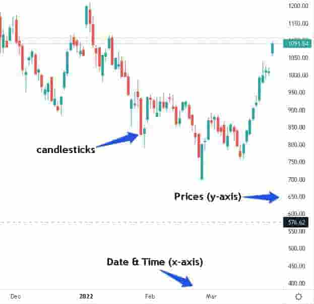
A candlestick chart shows information including:
- Candlesticks: These are the candlesticks on the price chart. Each candlestick shows a high price, low price, open price and close price over a time period.
- Price: On the right-hand side of the candlestick chart is the y-axis (vertical axis)which represents the price scale.
- Date & Time: On the horizontal axis (x-axis) below the price chart is the date and time.
A visual representation of candlestick price chart components is below.
A visual representation of individual bullish and bearish candlestick components is below.
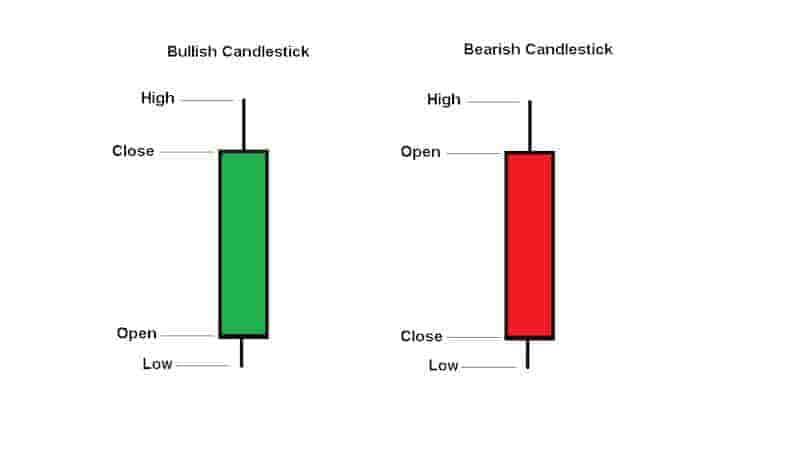
The hollow section in the center (in green or red) is called the body. The lines annotated high or low are called "wicks".
Candlestick Chart Usage
Candlestick charts are used to graphically plot the prices of various financial markets from around the world. They can be used on many different timeframes.
What Markets Are Candlesticks Used On?
Candlestick charts are used in markets including:
- Stock Markets: Candlesticks are used to plot prices in stock markets around the world, e.g. Nasdaq, FTSE 100, The Nikkei, etc.
- Foreign Exchanges: Candlesticks are used to plot prices in currencies, e.g. EUR/USD, USD/CAD, GBP/USD, etc.
- Cryptocurrencies: Candlesticks are used to plot prices in cryptocurrencies like Bitcoin, Cardano, Ethereum, etc.
- Bonds: Candlesticks can be used to plot prices in bond markets e.g. U.S. rates 6 months bond, US10 year, etc.
- Options: Candlesticks can be used to plot prices in options markets e.g. AAPL options, MSFT options, etc.
- Commodities: Candlesticks are used to plot prices in commodities like Soybeans, Cotton, Corn, etc.
- Futures: Candlesticks can be used to plot prices in future markets e.g. gold futures, silver futures, oil futures, etc.
Generally, any capital market in the world with historical price data can be plotted using a candlestick chart.
What Timeframes Are Candlesticks Charts Used?
Candlestick charts are used on multiple timeframes. Examples include:
- 1 Minute Charts: Candlestick charts can be used to plot 1- minute charts, i.e. each candlestick represents 1 minute of time. Typically, this timeframe is popular among scalpers.
- 1 Hour Charts: Candlestick charts can be used to plot 1-hour charts, i.e. each candlestick represents 1 hour of time. Typically, this timeframe is popular with day traders.
- Daily Charts: Candlestick charts can be used to plot daily charts, i.e. each candlestick represents 1 day of trading activity. This timeframe is popular among swing traders.
- Weekly Charts: Candlestick charts can be used to plot weekly charts, i.e. each candlestick represents 1 week of trading activity. This timeframe is popular among longer-term swing traders or investors.
- Monthly Charts: Candlestick charts can be used to plot 1-month charts, i.e. each candlestick represents 1 month of trading activity. This timeframe is popular among long-term investors.
These are just the most popular timeframes for candlestick charting.
However, they can be used in any timeframe. This will depend on the timeframes a specific charting provider offers.
Candlestick Charts Examples
Below are examples of candlestick charts in different financial markets and different market conditions.
Example Bullish Candlestick Chart
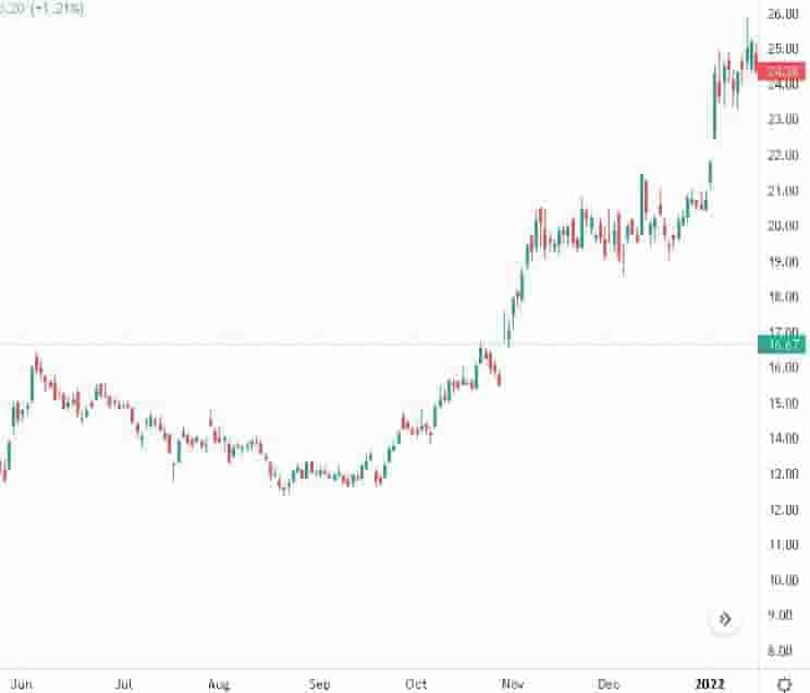
In the above candlestick price chart, the FORD stock is in a bullish uptrend as prices are rising and trending higher.
There are a large number of green candlesticks as price rises to higher levels.
Example Bearish Candlestick Chart
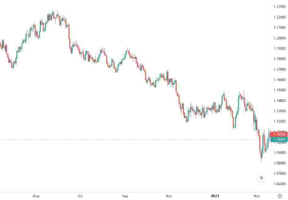
Example of a candlestick chart of EUR/USD showing a bear and down-trending market.
The price decline on this price chart signals that the EUR/USD is in a downtrend and bearish market conditions.
There are a large number of red candlesticks as price declines to lower levels.
Example Consolidation/Sideways Candlestick Chart
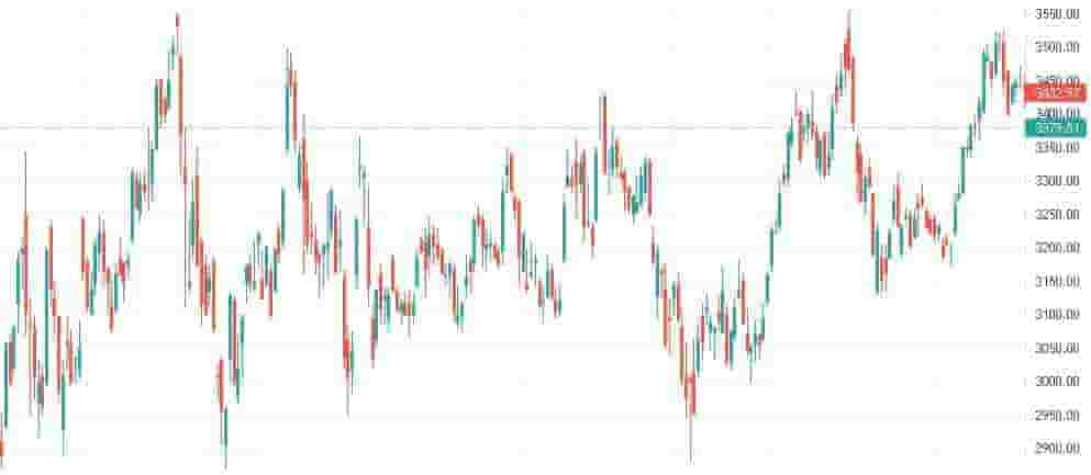
In the above candlestick price chart of AMZN, there is sideways or consolidation price action.
This signals that there is no clear trend up or down and that price is trading within a price range.
Candlestick Patterns
Candlesticks charts can form "candlestick patterns". Candlestick patterns are repeatable patterns that can help traders predict future price movements in a financial market.
These candlestick patterns can only form on candlestick charts. They are distinct and each pattern is unique in form.
Some of the most popular candlestick patterns found on candlestick charts include:
- Bearish Engulfing Pattern
- Bullish Engulfing Pattern
- Doji
- Evening Star
- Hammer
- Harami
- Harami Cross
- Inverted Hammer
- Morning Star
- Shooting Star
- Three White Soldiers
- Two Black Gapping
- White Marubozu
These are some of the most common candlestick patterns.
Candlestick Charts History
The first known origins of candlestick charts are in the 18th century by Munehisa Homma, a Japanese rice trader (1).
Homma discovered that the prices of rice markets were influenced by both the emotions of traders and also basic supply and demand.
Candlestick charts became more broadly popular around the world in the 1990's when candlestick charting techniques were published in the book, Japanese Candlestick Charting Techniquesby Steve Nison (2).
Today, hedge funds, prop firms, banks and retail investors all regularly use candlestick charts to plot the price of financial markets.
Candlestick Charts Terminology
Below are some common and popular terms and phrases related to candlestick charting.
Bearish Candle: This is a candlestick that forms when the closing price of a market is lower than the opening price. This signals bearish price action or a price decline.
Body: This is the center area of a candlestick. Usually, this is colored in green or red.
Bullish Candle: This is a candlestick that forms when the closing price of a market is higher than the opening price. This signals bullish price action or a price increase.
Candles: Traders sometimes refer to candlesticks as "candles". Candles are a slang term or shortened version for saying candlesticks.
Candlesticks: These are the candlestick-shaped plots on price graphs that represent the price action within a certain time frame.
Shadows: Shadows are another name for the "wicks" of the candles that are shaped like a vertical line above and below the body.
Tails: Tails are another name for the "wicks" of the candles. They are the vertical line above or below the body.
Wicks: These are the lines on top of or below the body of a candlestick. The wicks represent the high price and low price within a specific timeframe of the price action of a financial market.
Candlestick Charts vs. Bar Charts
New traders and investors sometimes get confused between candlestick charts and bar charts.
The only difference between a bar chart and a candlestick chart is the visual difference.
Both types of charts display the exact same information i.e. the open price, high price, low price and closing price.
The visual difference is in the "body" between the opening price and closing price.
Candlesticks display the "body" section in a rectangle and hollow area whereas a bar chart displays the area between the open and closing price in a simple vertical line.
Below is a visual representation of the difference between a candlestick chart and a bar chart.
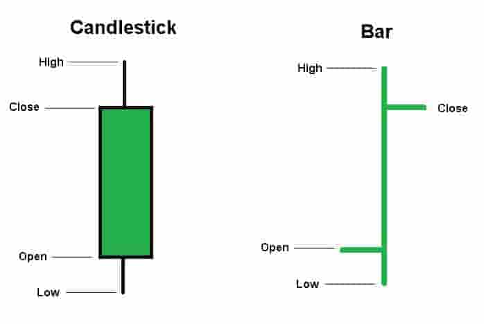
Which type of chart to pick is down to the individual trader's preferences. As both display the exact same information, some traders might find that the candlesticks are visually easier to interpret.
